
Policy Map
Visual & UX update
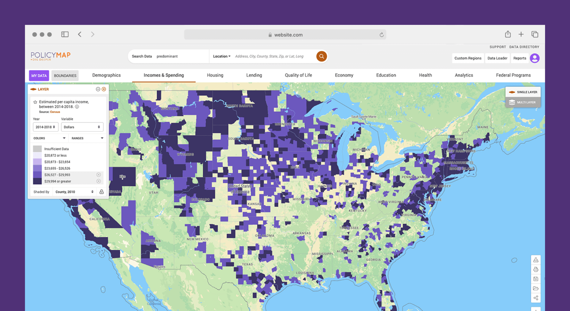
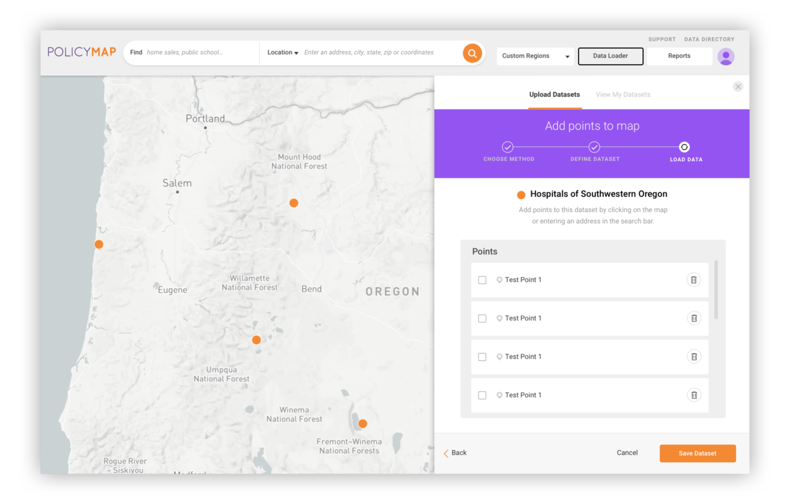
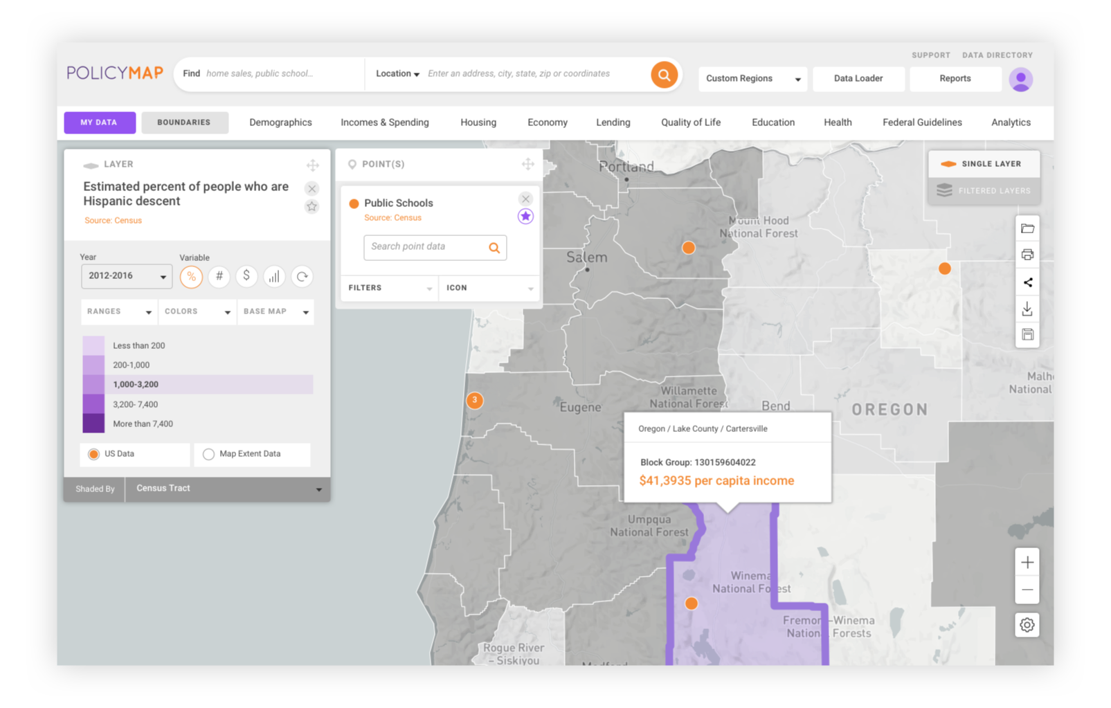
PolicyMap is a data and mapping tool used by government agencies, universities, healthcare institutions and nonprofits to solve place-based problems by democratizing data. We created a more intuitive user interface for their mapping software.
THE DIRECTIVE
Policy Map was looking to update their dated interface with more user friendly controls. They had a powerful data set and feature set that enable users to combine different filters. But the whole experience needed to be streamline for an online user.
MY ROLE
Lead UI Designer and Client Partner. I collaborated with the Policy Map team through a series of design sprints, meeting twice a week to pass sketches and iterations on the UI design. From this, I created a full-feature set of UI designs for the interactive map product.

Challenges
The underlying technology that powered their mapping platform had become antiquated and could no longer support their ambitious feature roadmap, so it was essential that the new version prioritize function, performance, and scalability.
Solution
We worked closely with PolicyMap to simplify the product interface and unify the design language across the application to ensure a clear and consistent user experience across all features. In doing so, we were able to elevate valuable but elusive features while retaining ample real estate for the application’s focal point: the map itself.